Level Up
An iOS app to track and visualize daily activities. Published in the App Store, 2021
Role
Product Design Lead
Industry
Health & Fitness
Duration
3 months
Problem
Habits are integral to mental and physical health, and many people struggle to maintain positive habits and eliminate negative ones. Existing habit tracking tools are often complex and difficult to use, making it hard to integrate them into daily life.
Design Process
Research
What kinds of activities do users want to track? What challenges do users face with current tracking tools? How can we reduce friction to make tracking easier and more consistent?
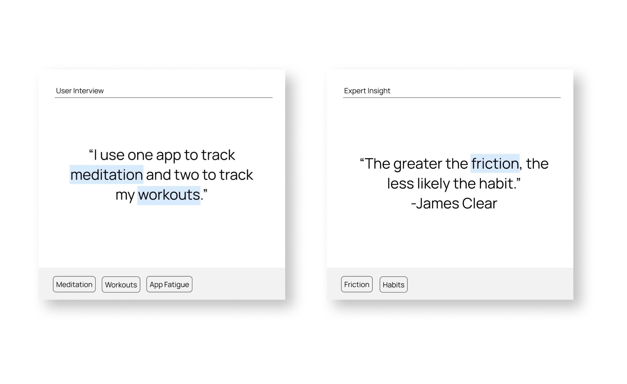
To find answers, I interviewed four people with varied tracking routines to gain qualitative insights into their experiences, frustrations, and uses of existing tools. I also reviewed literature on habit formation and friction in behavior tracking, focusing on what goes into the making of good habits and the cessation of bad ones.
Insights
Users track a wide range of activities, from symptoms and medication to creative projects. Managing multiple specialized apps is overwhelming, leading to app fatigue.
Friction as a Barrier:
Even minor obstacles, such as complicated logging processes or switching apps, deter users from consistent tracking. Reducing friction is critical for sustaining engagement.
Limitations of Wearables:
Devices like Apple Watch are useful for tracking physical activities but are not able to facilitate activities like mood or medication tracking. Their high price, need for frequent charging, and the requirement to be worn consistently further limit their utility.
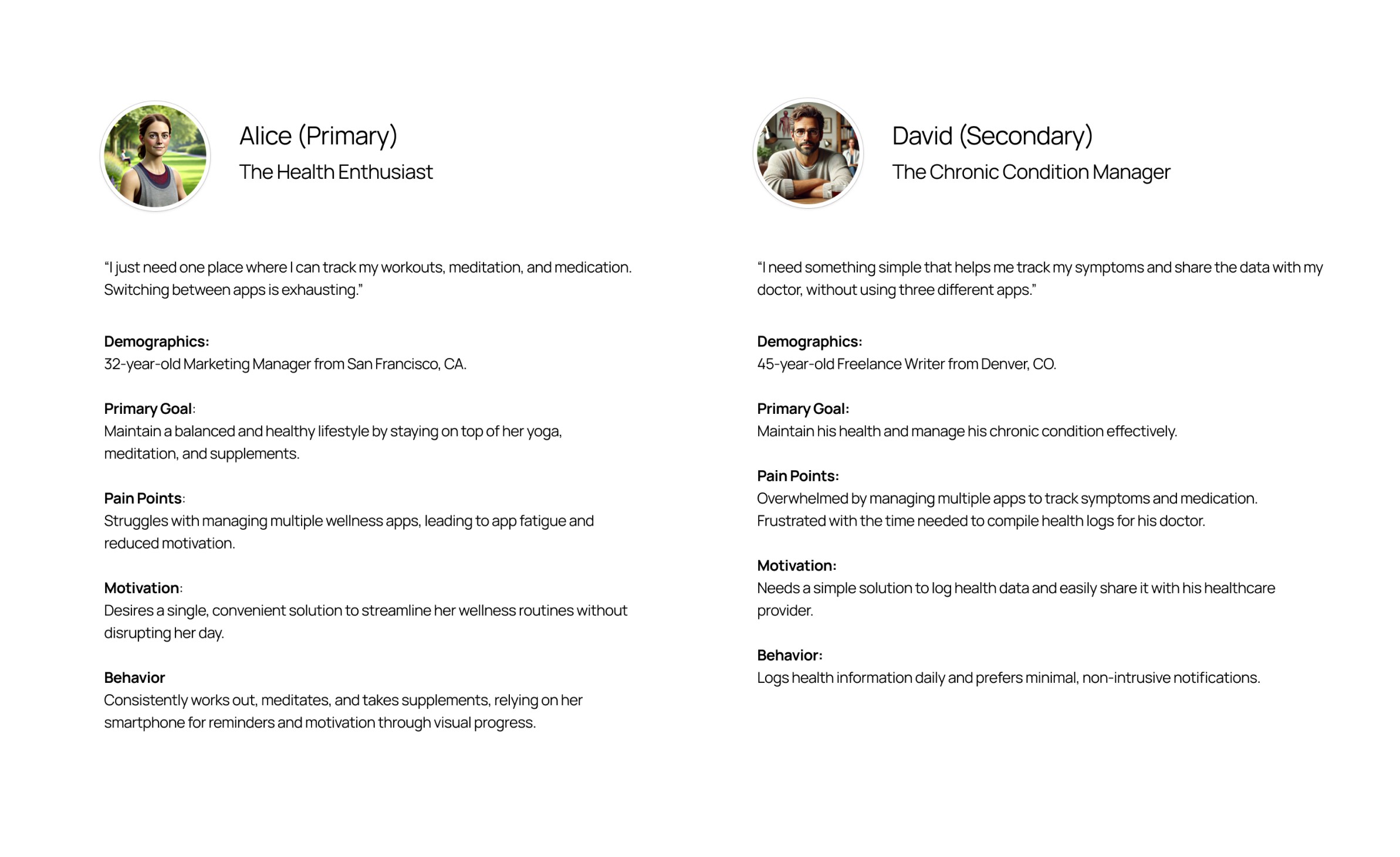
Personas
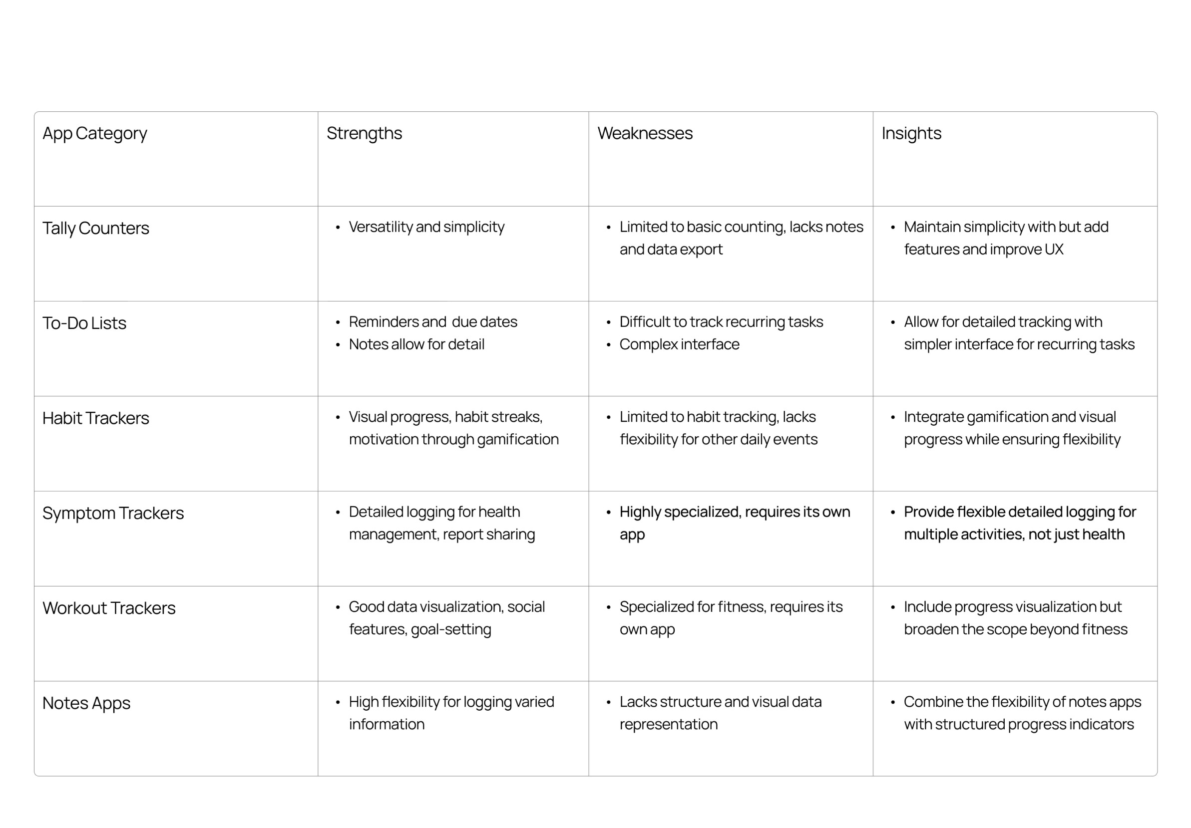
Design Benchmarking
Design Goals
Based on my research, I settled on the following goals to guide the design of Level Up:
Tracking Versatility:
Users need an app that can track a wide range of activities. Level Up should support tracking of medication, symptoms, workouts, and projects all in one place, allowing users to reduce app fatigue and consolidate their tracking.
Minimize Friction:
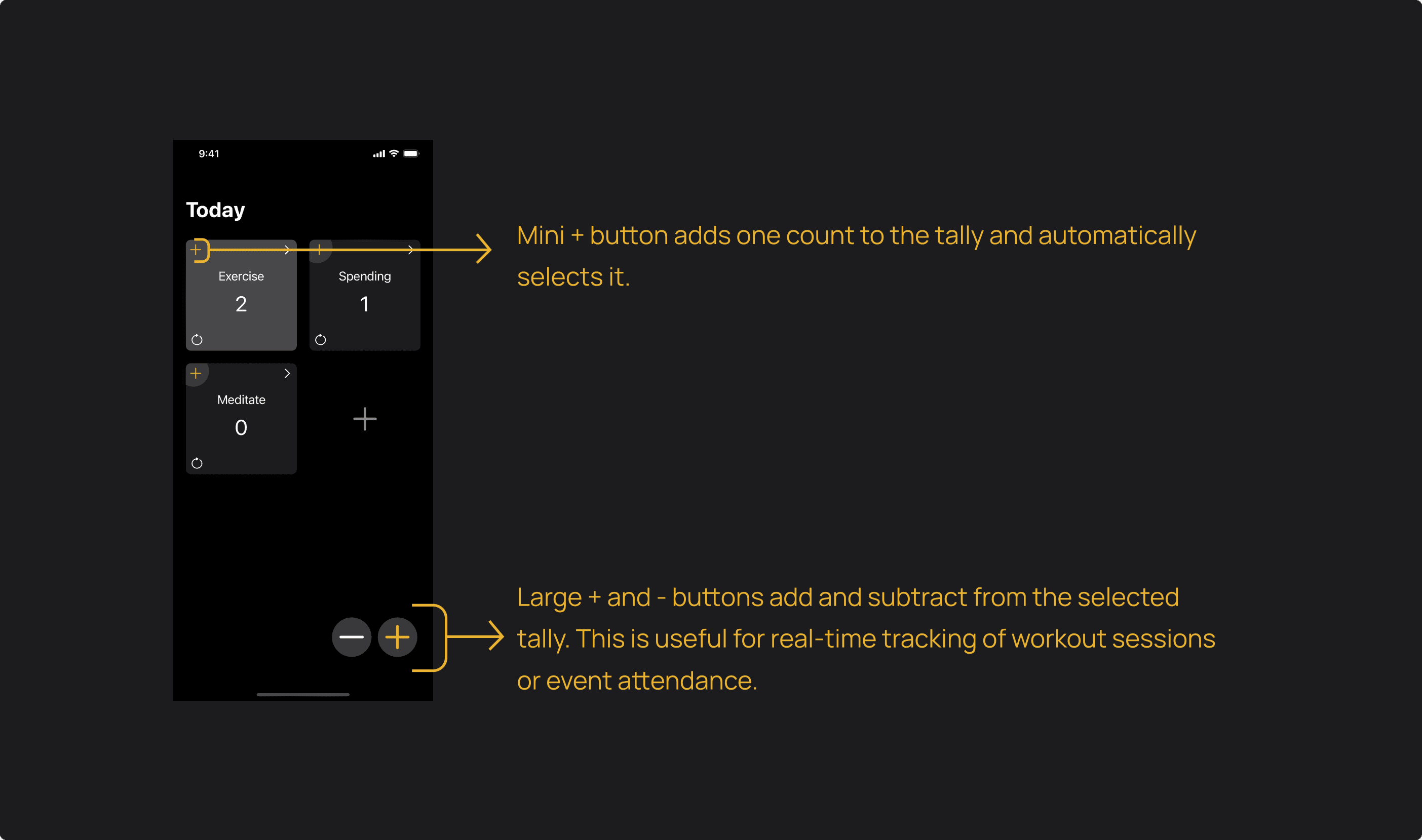
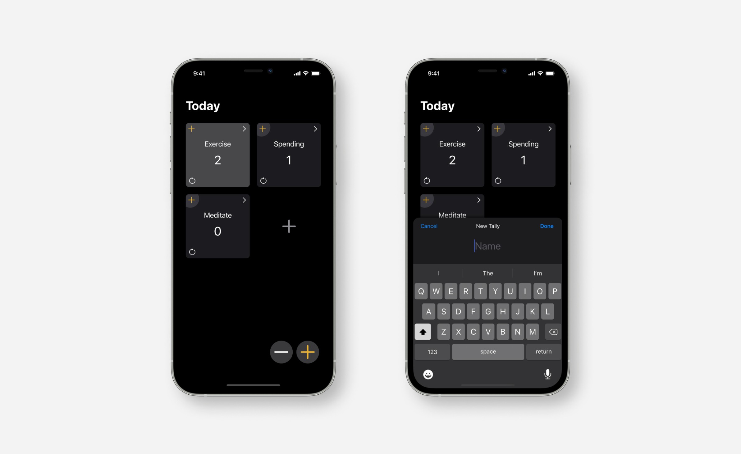
Even minor obstacles can prevent users from sticking with tracking routines. Level Up should enable one-tap logging, and be simple to navigate. The interface should be intuitive and familiar to iOS users, minimizing the cognitive load required to use it.
Generate Insights:
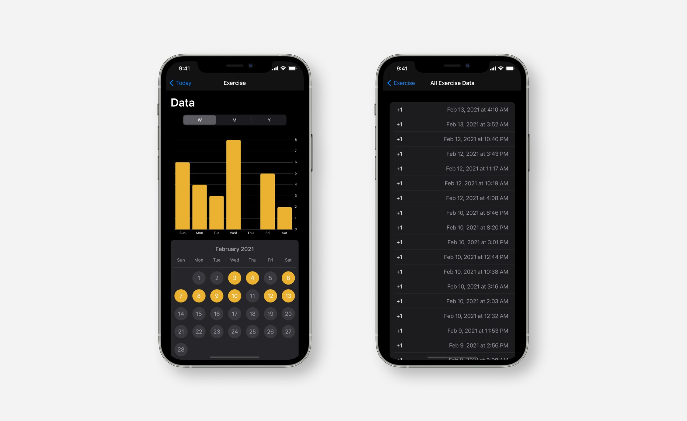
Users often struggle to gain meaningful insights from their data. Level Up should organize and present tracked data in a way that makes it easy to understand progress, helping users reflect on their goals and make informed decisions.
Data Ownership:
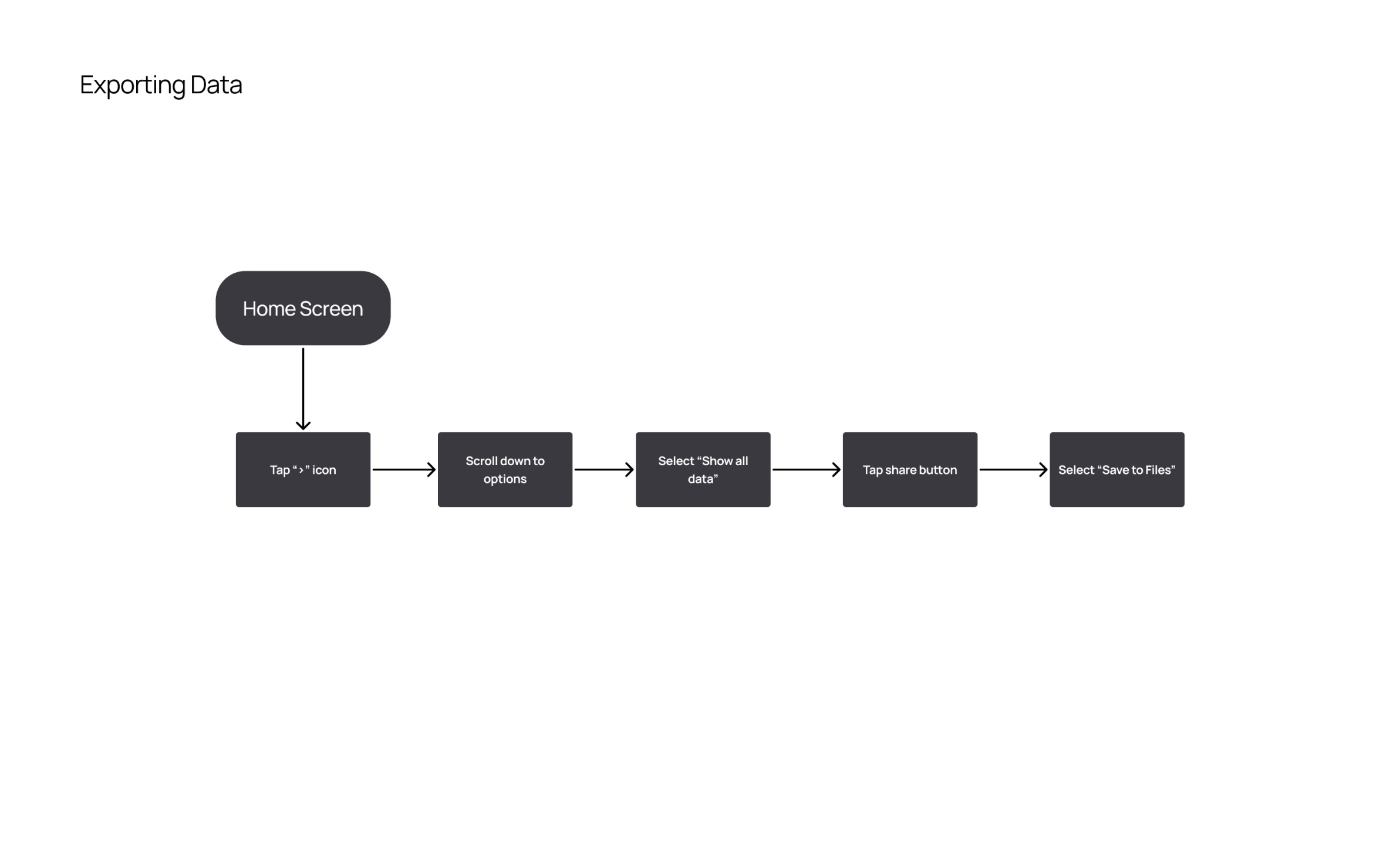
Users should own their data and be able to easily export it in common formats (e.g., CSV) for personal use, or to use another platform to further analyze their data.
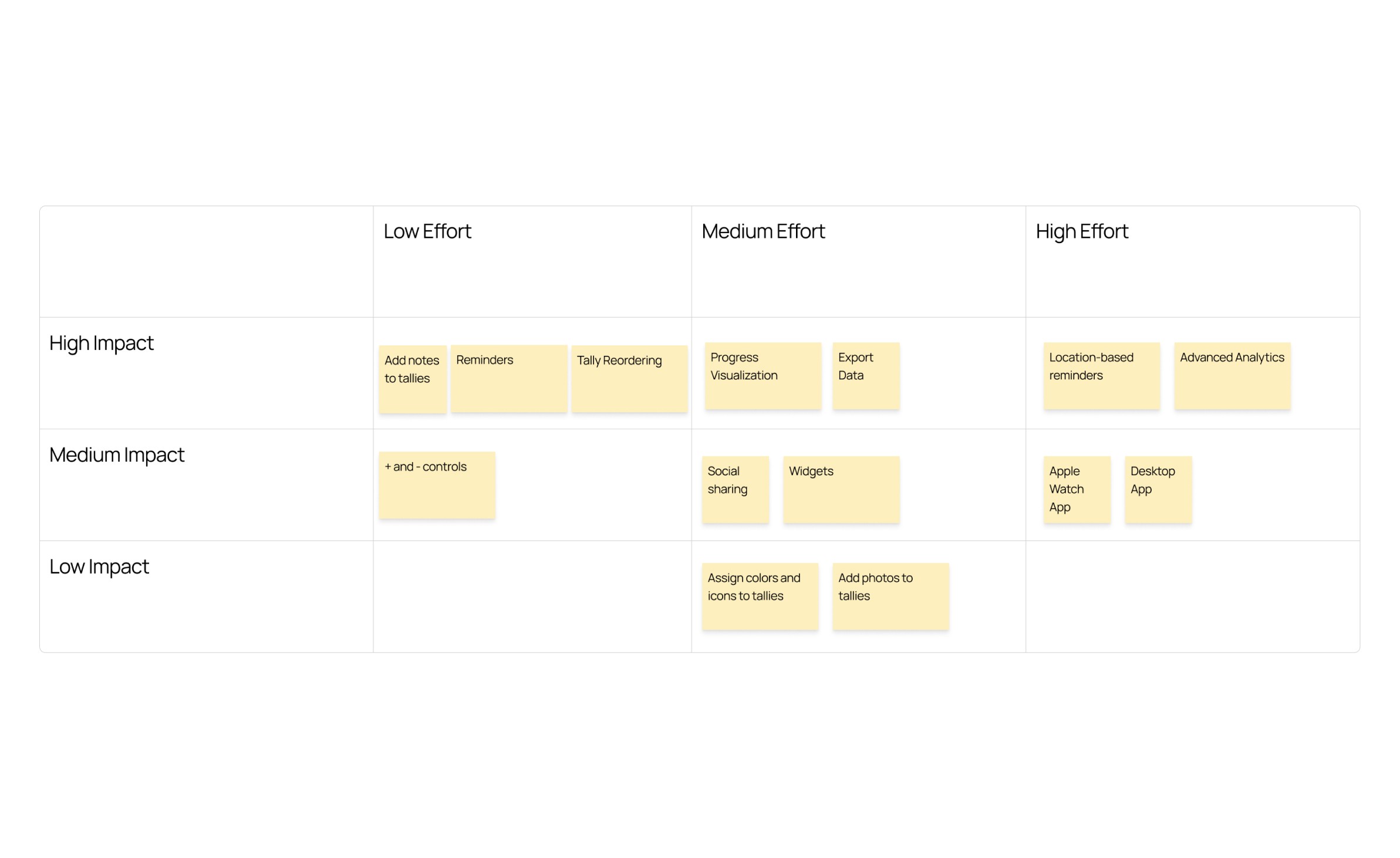
Decision Matrix
User Flows
I designed user flows around each of the core features of the app, visualizing how users would accomplish essential tasks like adding to a tally and exporting data.
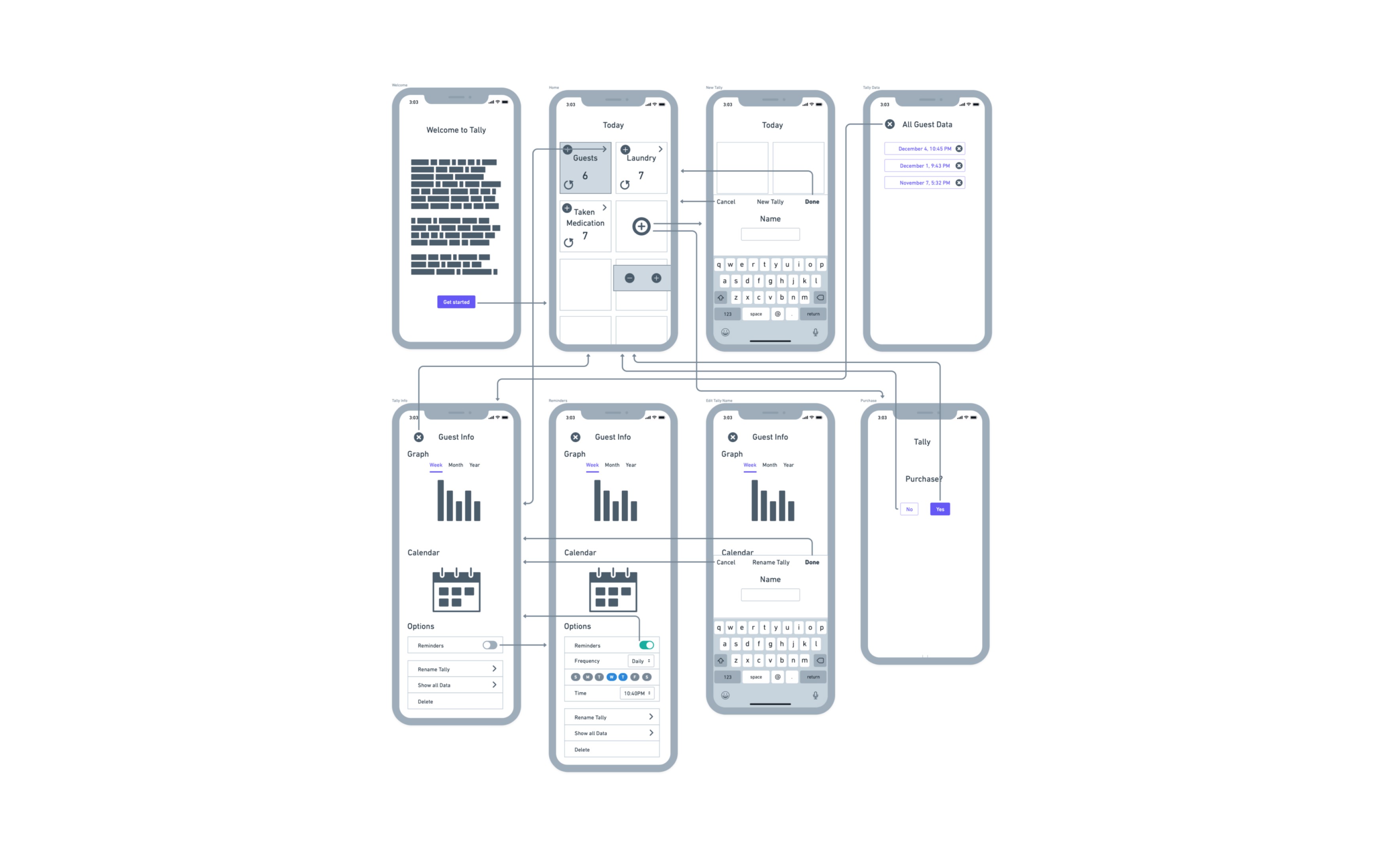
Wireframes
Style Guide
I designed the style guide to create a distinctive brand identity while aligning with iOS standards, making the app familiar to iOS users.
UI Designs
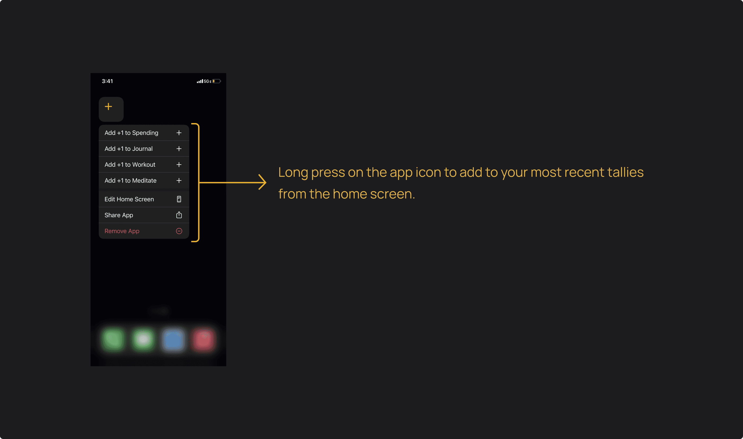
I designed the interface to be simple and familiar for iOS users, with three easy ways to log events:
Final Designs
Results
Shipped on Time and Within Budget:
Managed the development process efficiently, gaining App Store approval and launch within three months.
User Satisfaction:
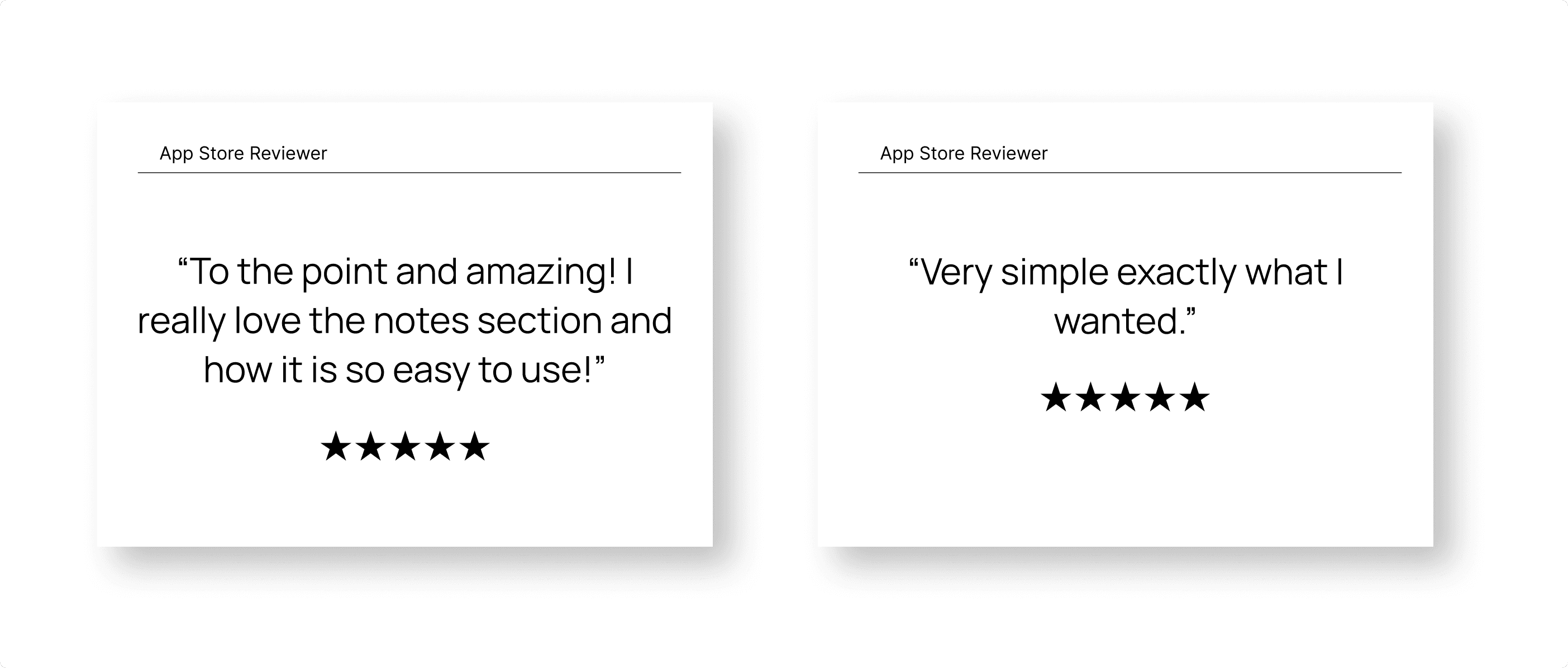
Level Up has earned a 4.7-star rating on the App Store with over 120 reviews.
Market Performance:
Level up has achieved 10,000+ downloads in the App Store across 115+ countries.
Profitability:
The app quickly reached profitability, leveraging a freemuim monetization strategy with a simple lifetime payment upgrade.
Learnings
Some takeaways I've learned though the process and in conversations with users:
Familiarity Enhances Usability:
Leveraging the iOS Human Interface Guidelines significantly improved usability and allowed me to create an experience that felt intuitive and familiar to iOS users. This helped to minimize the learning curve and helped users feel comfortable from their first interaction.
Simplicity is Essential:
Achieving simplicity in design is far more challenging than complexity. Stripping the app down to its essential features while maintaining usability required countless iterations, but ultimately resulted in a cleaner, more accessible user experience.
User-Requested Features:
User feedback is invaluable for uncovering new feature ideas and improvements. Some features users requested were: retroactive logging, archiving tallies, and adding notes to tallies by default.
Other projects
Product design for Angles: A platform to automate medical note-taking.
UX/UI design for Augmented Reality Eyewear

